


I wanted light playful colors for the daycare that were not to bright or generic. I knew I wanted to use a colored paper for my project because the daycare as of now is a small, growing business that cannot afford to use more than two colors in the logo. Using a color paper gives another color aspect and more visual interest. I wanted the colors to be neutral in gender to appeal to both fathers and mothers. I wanted a vibrant blue that was eye catching to go with the light yellow colored paper to catch the viewers eye but not compete with the logo and information itself. The blue pops against the yellow toned paper. I wanted another strong color for the second color ink I though a red would be a nice contrast to the blue with out competing with the blue. This is my final color logo for print above. (The red prints much less pink than in this picture.) I came upon this simple color scheme for it is economical for my growing business to save money. Though this color pallet is not complex, making it less expensive to print, the colors remain too stay vibrant This is my final color logo for print above. (The red prints much less pink than in this picture.) I came upon this simple color scheme for it is economical for my growing business to save money. Though this color pallet is not complex, making it less expensive to print, the colors remain too stay vibrant              |


 |
| I originally wanted more of this type of color palette but when I started printing the logo onto the yellow toned paper I found blueish green color I wanted for the hippo itself (this above image was with a full bleed and the hippo is the toned paper) was not vibrant in print. I did color testes but now they were dull and did not have the pop color I hoped to achieve. |


| ||


 |
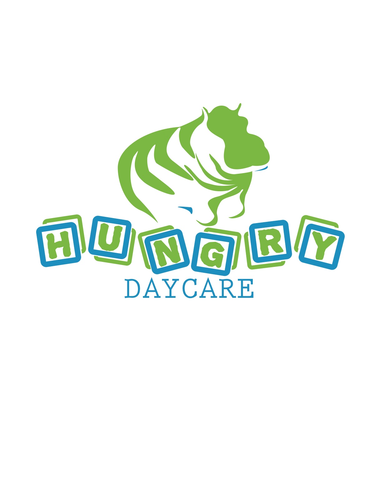
| This is the logo I decided was my most successful. My other logos were too serious for my business. I was able to expand my font library and come up with more playful logos. I feel this logo is the most successful because it is playful yet professional. It references the young, playful feelings that are present in the business thus enticing more parents to sign their children up. The parents see the logo as lighthearted, fun and thing the daycare will be the same. This logo will bring many new clients to the business. |


