light yellow/cream paper. This was the final paper I ended up using for all of my applications (the letterhead, business card, envelope, and fourth application.) I thought using the same paper for all of my applications was a smart choice for my company. Being a small business on the rise, Hungry Daycare does not have a very large budget for these types of necessities. The company is aware however of how important image is to the expansion of their business. I wanted to be aware of both the design and the budget in my applications to create something that would work for the client and make them happy so they can refer me to people in the future.
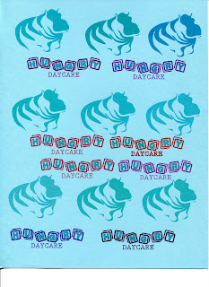
Final color tests on chosen paper for the red and blue dyes.
|


No comments:
Post a Comment