Monday, December 5, 2011

business card variations on screen

final 2 front business cards for print. The imagery on the card was too complex and took away from other parts of the card such as the dye cut at the top of the card that cuts out the top of the block lettering which I created the design to confine the letters like building blocks. This was the final typography I selected; I thought it was legible yet playful.
The yellow would be the paper. I found this was too complex, and the usage of the black lettering boring.


Yellow and white is to simulate yellow color of selected paper.


Final for print back of card. Dye cut on top of card to match the front blocks. white areas will be flush with paper.

color tests on variety of paper


light green textured paper

light green textured paper

light green textured paper. I thought this paper was too formal with the texture; it didn't say daycare.


bright powder blue

bright powder blue. I thought it might work being such a playful color, but having such a bright color spread was too overwhelming.

light green/brown textured paper

light green/brown textured paper. This paper was not playful enough at all.

light yellow/cream paper

light yellow/cream paper

light yellow/cream paper

light yellow/cream paper. This was the final paper I ended up using for all of my applications (the letterhead, business card, envelope, and fourth application.) I thought using the same paper for all of my applications was a smart choice for my company. Being a small business on the rise, Hungry Daycare does not have a very large budget for these types of necessities. The company is aware however of how important image is to the expansion of their business. I wanted to be aware of both the design and the budget in my applications to create something that would work for the client and make them happy so they can refer me to people in the future.


Final color tests on chosen paper for the red and blue dyes. 


Tuesday, November 29, 2011

screen color tests


I had to undergo many test prints and manipulate my colors on the computer screen in order to create the tones I was attempting to achieve.

Tuesday, November 1, 2011

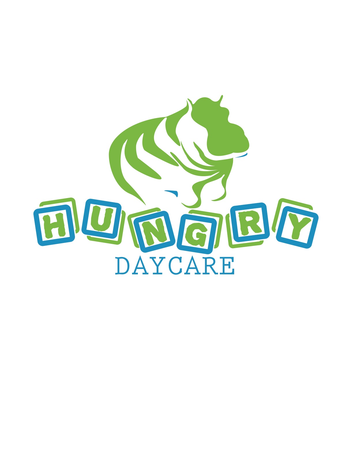
Logo color variations

I wanted light playful colors for the daycare that were not to bright or generic. I knew I wanted to use a colored paper for my project because the daycare as  of now is a small, growing business that cannot afford to use more than two colors in the logo. Using a color paper gives another color aspect and more visual interest. I wanted the colors to be neutral in gender to appeal to both fathers and mothers. I wanted a vibrant blue that was eye catching to go with the light yellow colored paper to catch the viewers eye but not compete with the logo and information itself. The blue pops against the yellow toned paper. I wanted another strong color for the second color ink I though a red would be a nice contrast to the blue with out competing with the blue.
https://blogger.googleusercontent.com/img/b/R29vZ2xl/AVvXsEhMWXHyis4NXcy5IIcGo18vD0IXN2kQP_1qp1vJljQzW03xwS63ZYv40OI6txIQvgbw8JU_rPjNzc5tmKgdkkZP0IRZsQ2uSSsgne27JbV8KwG7bAYAHNUyhdjjt3Cdebk51BAWa6ncPvs/s1600/Picture+1.pngThis is my final color logo for print above. (The red prints much less pink than in this picture.)   I came upon this simple color scheme for it is economical for my growing business to save money. Though this color pallet is not complex, making it less expensive to print, the colors remain too stay vibrant


Some of these variations may appear to be the same; however, there are slight differences in hue, vibrancy and slight contrast.


I originally wanted more of this type of color palette but when I started printing the logo onto the yellow toned paper I found blueish green color I wanted for the hippo itself (this above image was with a full bleed and the hippo is the toned paper) was not vibrant in print. I did color testes but now they were dull and did not have the pop color I hoped to achieve.